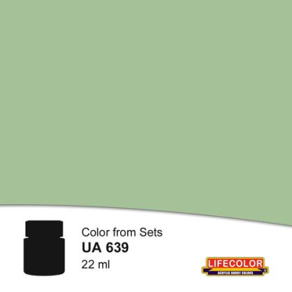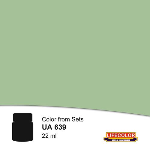
The green counterweight to the blue component of the same scheme, Royal Navy WWII W.A. Green from Lifecolor, completes the pale Western Approaches palette that British escort ships wore.
Responsibility details are not available.
The acrylic paint Royal Navy WWII W.A. Green belongs to the naval part of the Lifecolor range and represents the second color component of the Western Approaches scheme. Whereas the blue supplies a cool tone close to that of the sky, the green brings a slightly warmer and darker note into the palette, thanks to which the patches on a hull have contrast with one another without any of them standing out as a dark area.
Breaking up an outline works only when areas with a different brightness and a different warmth of tone meet on a hull. A single light color would brighten a ship but would leave its shape readable. The pair of blue and green sets a cool and a greenish component against each other, and the two behave differently in fog and dusk: depending on the state of the light, now one stands out and now the other, and the silhouette is blurred by that. In this the scheme differs from the contrasting black-and-white patterns that proved themselves in other waters and in other lighting.
The layout on a hull
The green usually keeps to larger continuous fields in the rear part of the side and on the areas that are meant to stay visually to the rear, whereas the blue concentrates toward the bow. There is no sharp dividing line between the fields; the edges blend and flow across the corners. On a model it proves worthwhile to apply the green after the blue and to unify the area with the remaining transitions.
Naši poradci a znalci sortimentu jsou připraveni odpovídat na Vaše dotazy (Po–Pá, 8–18 hod).
Zeptejte se na co potřebujete, odpovíme co nejdříve.
Texts from customers in the advice section reflect solely the opinions and views of the customers. MNF trade s.r.o. does not approve or verify customer texts in advance.
There are no questions here yet. Be the first to ask!