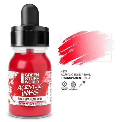
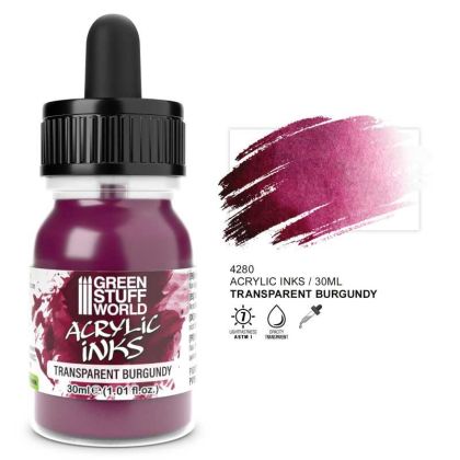
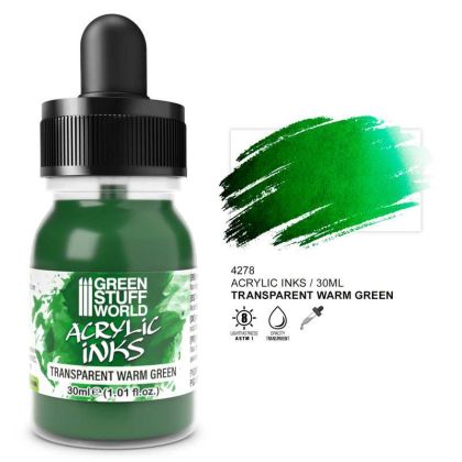
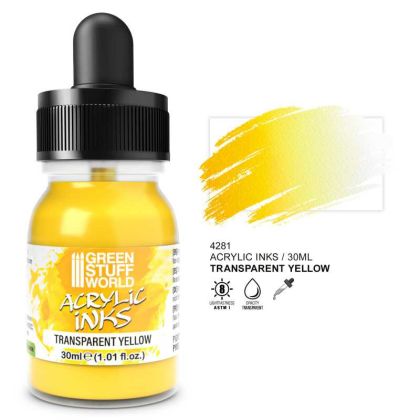
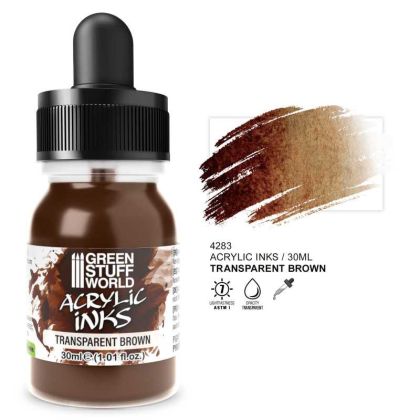
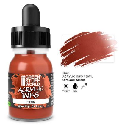
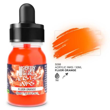
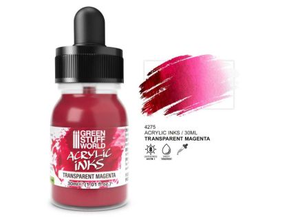
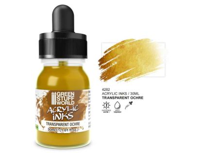
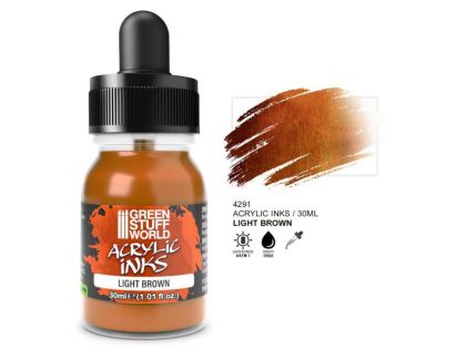
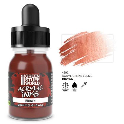
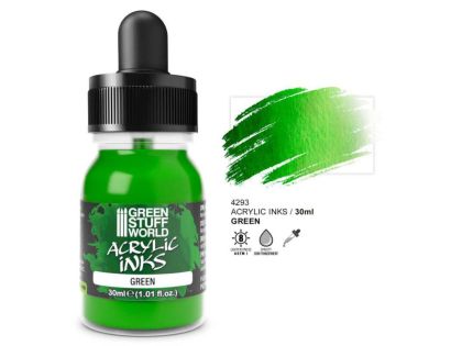
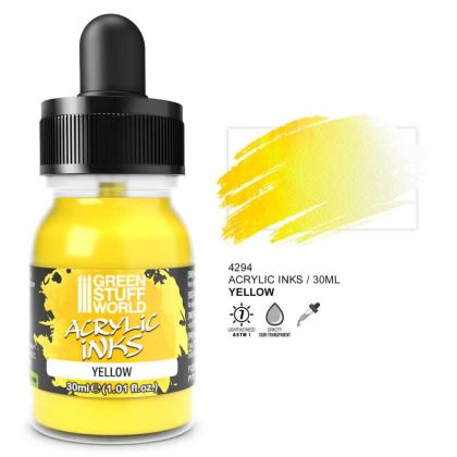
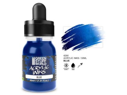
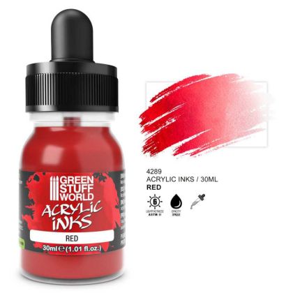
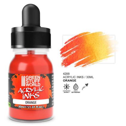
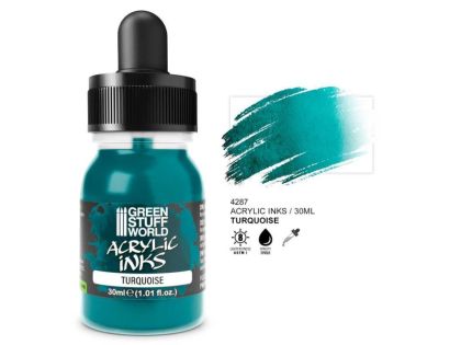
Acrylic Ink comes in three distinct versions. Transparent shades act as a colour filter and suit glazes over finished paintwork. Opaque versions carry enough pigment to serve as a paint in their own right. The fluorescent version adds luminosity for energy effects and fantasy details. The pigment is very fine throughout, so all three pass through a narrow nozzle.
The one thing they share is a liquid consistency, which is also the thing to watch. An ink will happily run down a vertical surface and stop at the bottom edge. How to layer, prime and spray them is below.
Transparent inks do not cover; they only change the tone of what lies beneath. They are used to unify camouflage, create coloured shadows, deepen cloth or tint metal towards brass and gold. Opaque inks hold considerably more pigment and behave like a very free-flowing paint, so they can be used over a base that is not specially prepared. The fluorescent version has a high-response pigment for details that need to look as if they are glowing.
Colour depth with inks is built gradually. Three thin glazes look better than one heavy coat, which settles unevenly and leaves a dark edge. Let each layer dry completely before the next.
The fine pigment is an advantage, but the ink is low in binder and dries quickly on the needle. Work at lower pressure and adjust body with a product from thinners and cleaners.
Transparent and luminous shades need a pale base or they go dead; choose one in surfacers and primers. Opaque inks cope with a grey base without complaint.
The maker's other lines, effect and flexible paints among them, are in Green Stuff World acrylic paints.